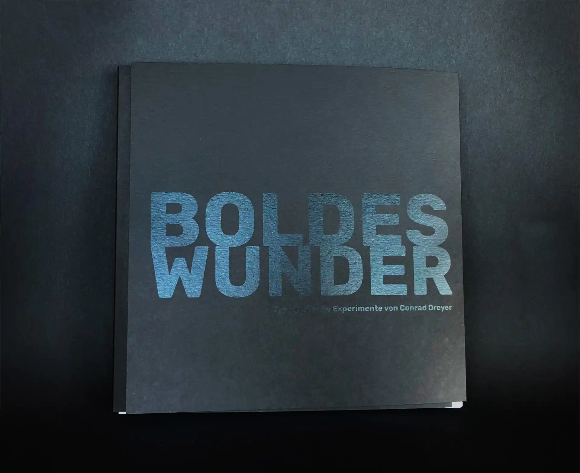
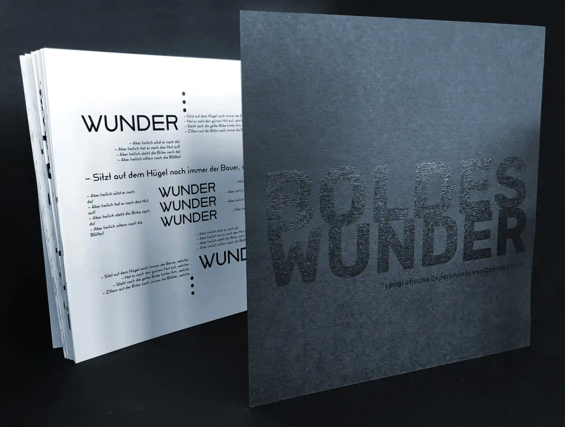
In order to keep the leporello like inner part of the book in shape and in the right place, the cover is realized as a winding fold opening to the right, which can be closed with a Velcro fastener. The black print on the black cardboard gives the cover a valuable, minimalist aesthetic, but - under the right lighting conditions - makes the title stand out brilliantly.
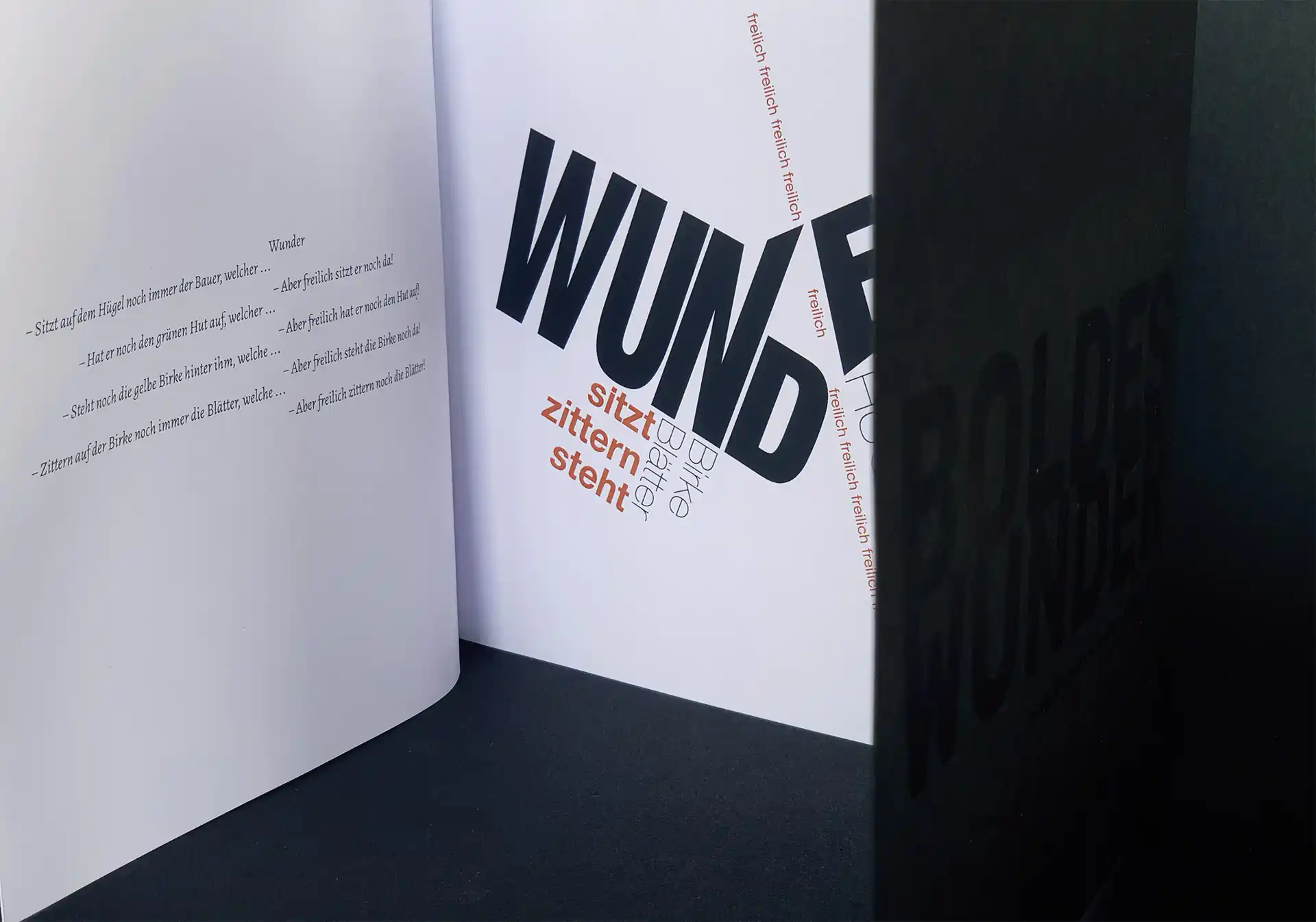
In terms of content, the book is initially concerned with the layout of business cards and letterheads, and in doing so addresses the influences of the Bauhaus. The eight typographic systems are then explored on the basis of Wassily Kandinsky's poem "Wunder" (Miracle), and then - again in the spirit of the Bauhaus - typographic collages are discussed. Finally, this book deals with the typographic discipline of set composition by means of a review of Kandinsky's work "Vergessenes Oval", from which the poem is also taken. BOLDES WUNDER invites us to lose ourselves in the sheer endless possibilities of typography.